Growth Curves have never been easier. Or faster.
An app for analysis of high-throughput phenotypic microarray data
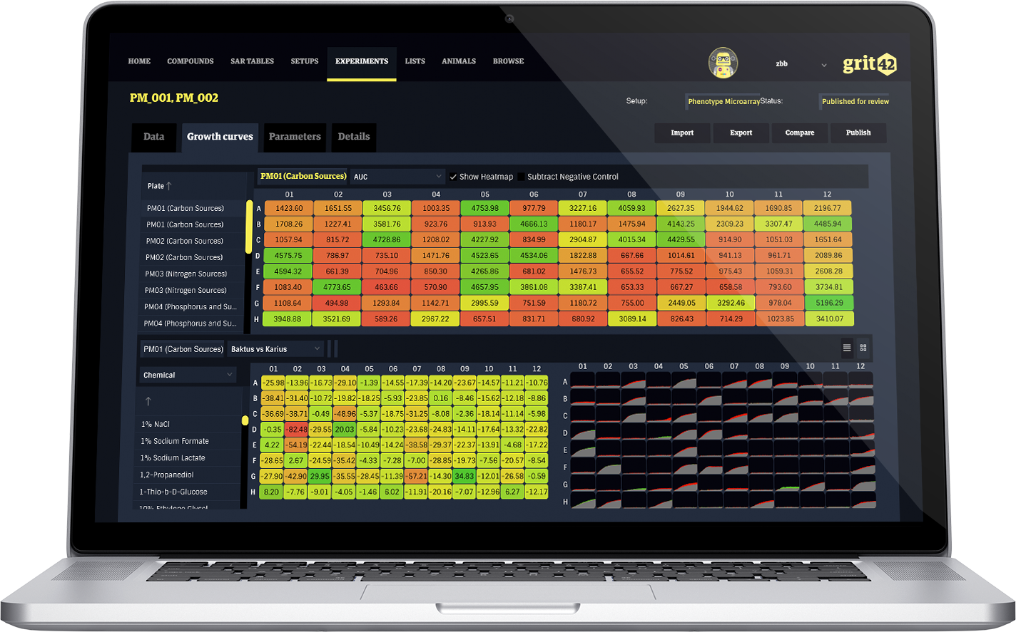
Using our app, we support analysis of high-throughput phenotypic microarray data from the OmniLog® instrument, made by Biolog. This technology is used for comprehensive and precise quantitation of phenotypes, enabling a perspective of the exposure to different environments, as well as determining a cell’s metabolic and chemical sensitivity properties.
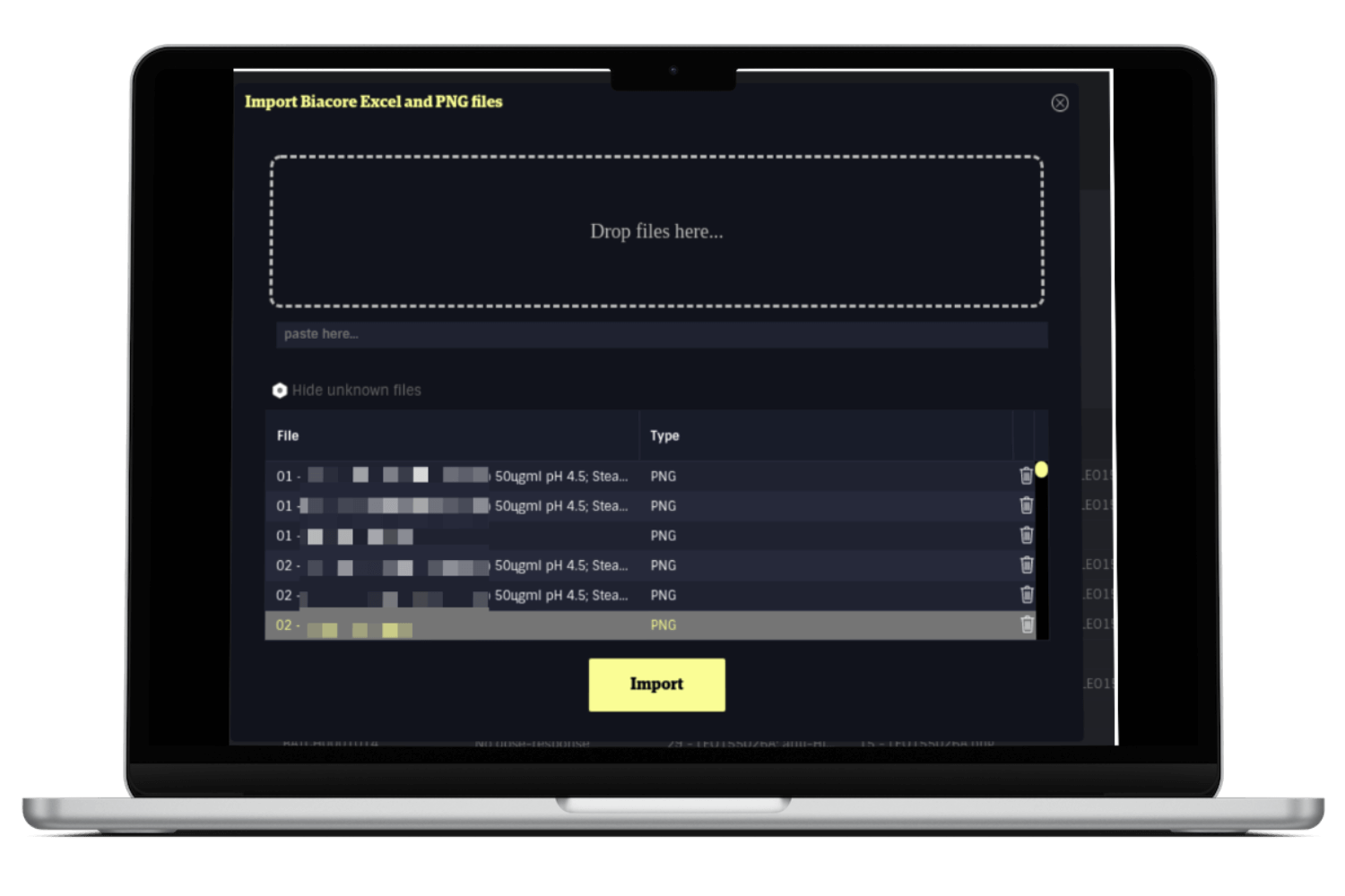
This app works as a standalone, so it’s ready to run from our servers with your own personal login. Quick and easy.
For identification of phenotypes of mutants, we use Biolog’s high-throughput phenotypic microarray instrument, OmniLog. However, we find the provided software is lacking key features and not very easy to work with. Much to our pleasure, grit42’s Growth Curves app, offers a nice and interactive way to analyse the data from the OmniLog instrument. For example we can now see the average of replicates and in the plate format, we can see the percentage of inhibition with the ability to switch reference in one click. On top of these – and additional – features, most importantly though, our analysis workflow is now 15 times faster!
Bacterial Infections Group Head at EVOTEC, Dr. Michael Mourez, PhD.
15 times faster identification of phenotypes of mutants
Other applications includes
- Mode of action studies of antibiotics.
- Profiling of cleanroom bacteria – identification of unknown microbes or fungi
- Optimization of cell lines and culture conditions in bioprocess development
- Characterization of cell phenotypes for taxonomic or epidemiological studies
- Determination of a cell’s metabolic and chemical sensitivity properties
The workflow in 6 easy steps

1: After the run, export the data
After you’ve run the OmniLog instrument for 24-48 hours, you export the raw data from the native software that comes with the instrument.

2: Drag’n’Drop import
Once you have the raw data file from the OmniLog instrument, you simply drag’n’drop it in our app to import it. You’ll be prompted to name it, so you can easily locate it after the import.

3: Automatic processing of the data
As soon as you import the file, the app automatically calculates various values, including area under curve (AUC), min, max (A), slope (μ), growth curves, averages on duplicates, delta wildtype and clone. This process is done in minutes.

4: Visualisations
At this point the Growth Curves App offers visualisations of the data in table and plate views. This enable the performance of a the first QC of the data and hence experiment. Does everything look good? Can we conclude that the experiment went well?

5: Flexible analyses and comparisons
Toggling between various heatmaps, all the results from the automatic calculations are readily available. Furthermore, comparisons between different datasets is available with a few clicks, enabling advanced heatmaps and overlays of the growth curves. You can also mouseover for details on each of the wells in the layout.

6: Export data and visualizations
After all the previous steps, you can export the data and the various visualizations for reporting and presentations. All the experiments are stored on our platform, allowing for historic comparisons of data sets.
Example: Comparing an active data set against another older data set
We’re continually developing this application together with the bacterial infections group at a top 10 pharma, one of Europe’s leading biotechs, as well as input from US governmental institutions.
The analysis of the phenotypic microarray data, is supported by the OPM package, published by Vaas et al. (2013) opm: An R package for analysing OmniLog® Phenotype MicroArray Data. Bioinformatics 29: 1823-1824.